


A New Evernote PDF Annotation Interface + Four Improvements


Newsletter housekeeping: The latest version for PC & Mac is 10.131.3. You can grab it from the download page. Latest mobile version is 10.131.8.
Many thanks to Neil and Anon who have supported Taming the Trunk over the last week, its much appreciated. If you find this article useful and have it in your pocket to support my efforts you can tip me a coffee here.
Check that you're on the latest version and you should see a different user interface for the annotation of PDFs and images. It’s a big change and looks a lot smarter.
As you can see from the image above it’s changed a lot.
Functionality is the same so no new features, nothing taken away but the layout is a lot nicer.
It’s also fixed a very irritating bug where the right hand scroll bar would mess with the position of where the annotation would appear, you had to make sure the scroll bar was always at the top.
All the same shapes, lines, arrows and colours are there at the top instead of the side.
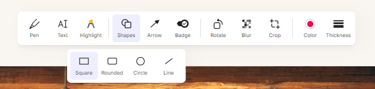
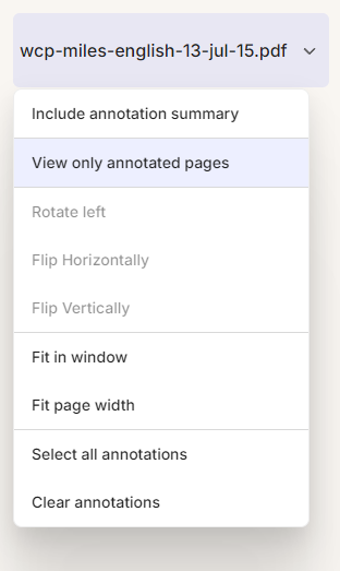
If you want to rotate an image you now head to the dropdown box at the top left of the screen where you'll also find image flipping and sizing functionality.
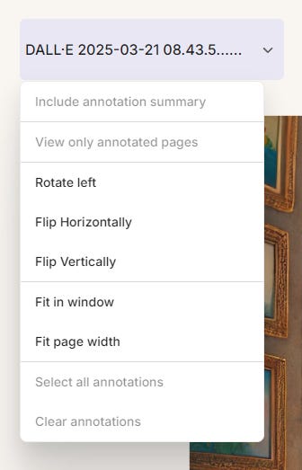
Things look slightly different when you annotate a multi-page PDF.
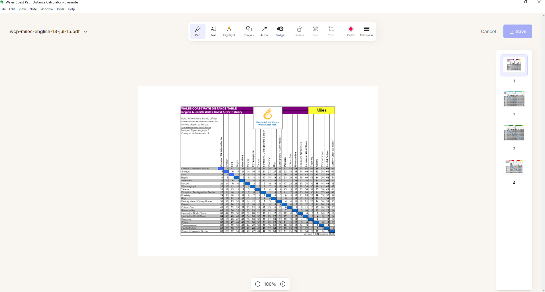
All the pages from the PDF show in the right-hand column so you can navigate quickly, the tools at the top are the same as before but the annotation controls are now behind the drop-down box at the top left.
Functionality stays the same, no new features but stability has been improved. I used to have issues with the image/PDF position on the screen and annotations being all over the place. That seems to be fixed.
Evernote is my main tool for annotations and I send lots of screen grabs to my clients so anything to make this better is a positive.
If I had to have a moan, I sometimes feel some of the shapes and symbols look a little tired and old-fashioned, maybe it’s because I've been using it for so long, what do you think?
Have you used the new interface yet? Do you annotate a lot? Let me know in the comments.
Image controls & transcribe button moved
A lot of folk have been asking for the image transcribe button to be moved or made smaller as they thought it covered too much of the image as it also showed file name and size right across the top of the image when you hover or click it.
In the latest version of the desktop apps the image controls have been shifted to the right of the image and we've lost file name and size in the Preview view.
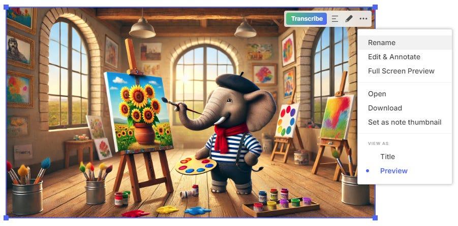
If you still need to see the file name and size then switch to Title view and all the info is there.

What do you think of the change? I must admit I'm non-plussed. I didn't mind the strip along the top. Let me know what you think in the comments.
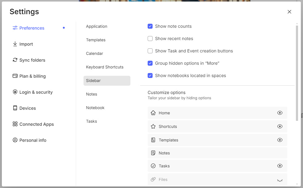
Evernote sidebar customisation now syncs across devices
We've been able to customise the sidebar for a while now. Not enough in my opinion as I'd love to be able to re-order everything as well, but it’s a start.
Head over to Settings -> Sidebar and you'll see a bunch of options including hiding and showing buttons and sections.
You can also customise the navigation bar at the bottom of the mobile app as well. Go to Settings -> Navigation.
The new functionality makes these settings sync across devices, but only the same type of device.
Desktop apps sync with other desktop apps. So, if you have two Windows devices and a Mac, they will sync the sidebar settings.
Mobile apps also sync as well so if you have two iPhones and an Android phone the settings for your navigation bar at the bottom of the screen will sync.
Right now, as far as I know, tablet navigation doesn't sync but they are working on making the tablet experience better.
What doesn't happen is syncing between desktop and mobile apps as the navigation is very different.
Is this useful? Let me know in the comments.
A little bit of extra font control
A nice little improvement that slipped under the radar for me a couple of weeks ago was some more font control.
Before, when you selected the font size in the editor you could only pick from the options in the dropdown list.
You can now enter your own custom size like this.
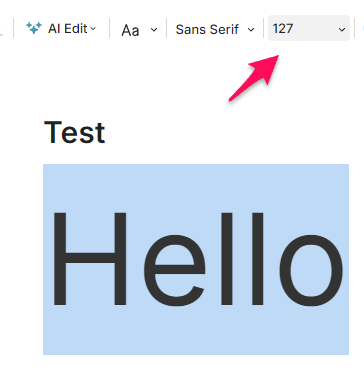
From my testing and looking at some very large text(!) the upper limit for the font size is 400.
Is that big enough?
And finally... notifications are now black and they've moved
Something you may have noticed with the latest version is the notification block has changed from blue to black which I think looks a bit smarter.
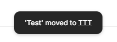
The notification now appears at the bottom of the screen.
The blue bar is still there when you perform multi-select actions so there's a nice differentiation between actions and notifications.
That's it for this week. As always let me know your thoughts in the comments.
Have a great weekend
All the best
Jon
One more thing, I was intrigued by "Right now, as far as I know, tablet navigation doesn't sync but they are working on making the tablet experience better." I'm hopeful for a more desktop like client on the iPad. There is such a gulf between the feature set and the promise of v10 was to make things more consistent across platforms.
Jon
You mentioned that you use EN for all annotations. Now that you joined the Walled Garden (AKA: Apple ecosystem), you may want to try the annotation tools that are built into the Preview and Mail apps. I find them a lot easier to use, as they don’t require that I go to EN when the PDF or Image I need to annotate is not in EN to begin with and I have no reason to store it in EN.